Understanding the skills of making brochures for advertising
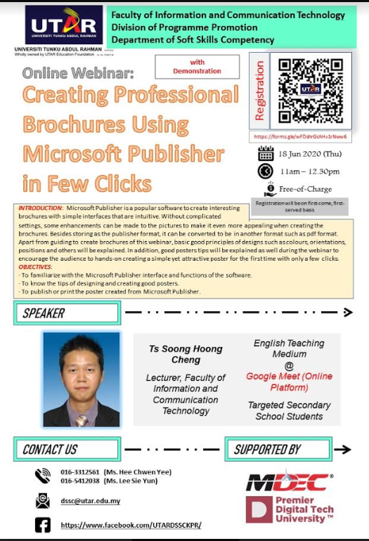
An educational webinar titled “Creating Professional Brochures Using Microsoft Publisher in Few Clicks” was organised by UTAR Faculty of Information and Communication Technology (FICT), in collaboration with Division of Programme Promotion (DPP) and Department of Soft Skills and Competency (DSSC) on 18 June 2020 via Google Meet. The invited speaker was FICT lecturer Ts Soong Hoong Cheng.
The webinar aimed to familiarise participants with the Microsoft Publisher interface and its functions when designing posters. It also aimed to teach participants how to create a professional brochure for advertising and promotional purposes using the software Microsoft Publisher.
At the sharing session, Soong explained the multiple types of brochure, namely Bi-Fold, Z-Fold, Accordion Fold, Roll Fold, Gate Fold, Double Parallel Fold, Double Gate Fold and French Fold. Apart from that, he also explained how Microsoft Publisher can contribute to creating a better visual impact for brochures in PDF version, XPS version and even high-quality prints.
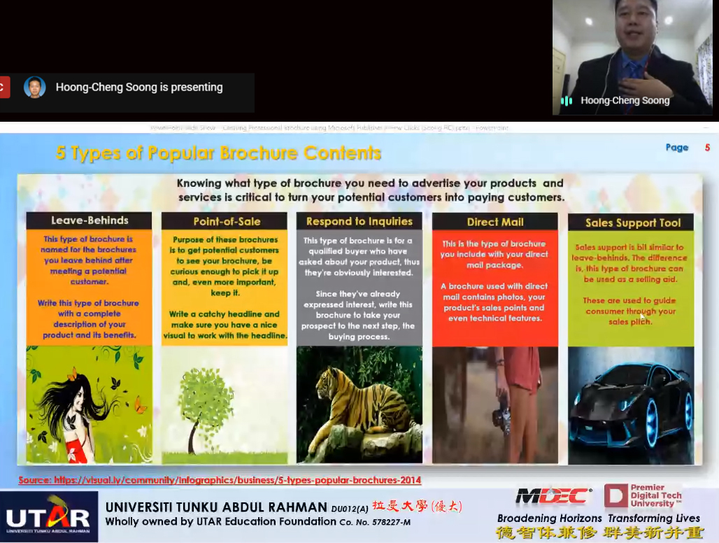
Soong said that the users need to know the types of brochure they need to advertise because it is vital to attract their potential customers. He then moved on to explain the five types of popular brochure contents which were leave-behinds, point-of-sale, respond to inquiries, direct mail and sales support tool.
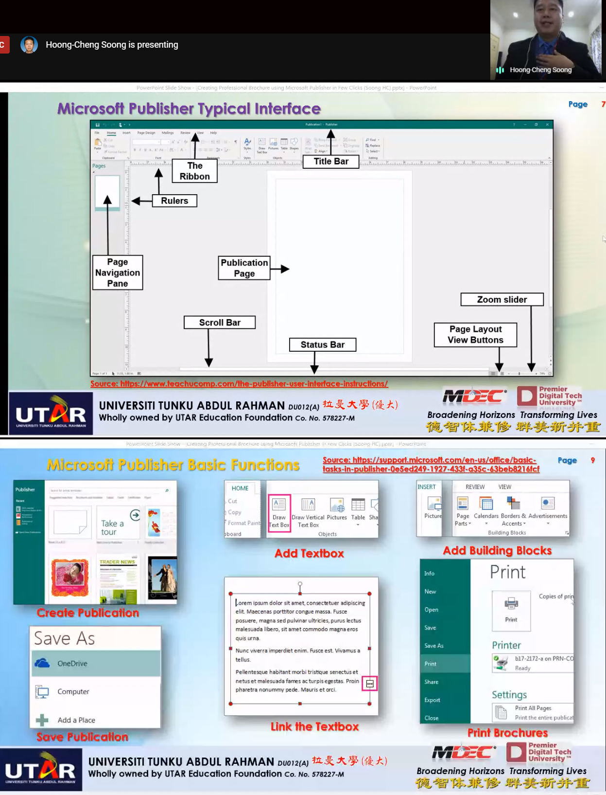
“Microsoft Publisher is a desktop publishing application from Microsoft, different from Microsoft Word which emphasises on page layout and design rather than text composition and proofing,” he said. For Multimedia Elements, Soong highlighted he mainly uses Text and Picture elements in Microsoft Publisher, while the other remaining elements such as audio, video and animation are more suitable for web publishing, kiosk systems, e-Learnings and others.
Furthermore, he also stressed on the appropriate type of fonts, the good type of image (Vector Image vs Bitmap Image) as well as the elements of design (colours, line, mass, movement, space, texture, type, and value). He also said it was important to pay attention to the principles of design, namely balance, contrast, direction (visual illusion), rhythm (repetition), economy (precise and simple), emphasis, proportion, and unity (harmony) when creating a brochure.
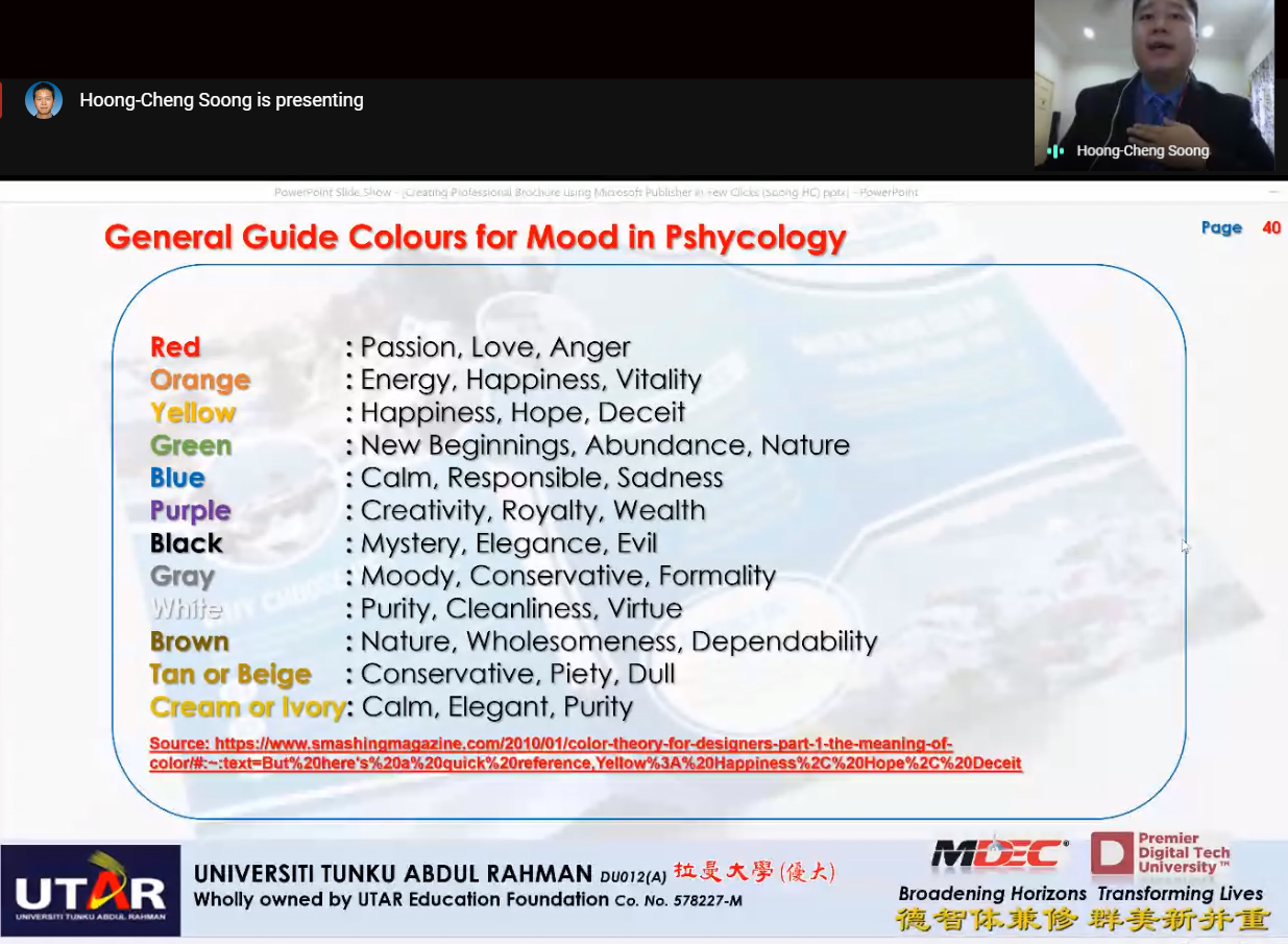
After the brief explanation on design principles, he continued to share the examples of best brochure design templates to the participants. In addition, Soong elucidated on a colour formula using the available colour wheel, where users can create a colour scheme from the scratch for an initial idea. He also taught participants the general colours for mood based on psychology and the benefits of incorporating the right colours to create a perfect brochure design.
Towards the end of his sharing session, Soong showed a live demonstration of creating and designing a sample brochure using Microsoft Publisher. The sharing session then ended with an interactive Q&A session. The webinar session was attended by 168 participants with 183 total view.

Soong showing the complete brochure design

Soong highlighting the types of popular brochure contents

Soong introducing the Microsoft Publisher Interface

Soong clarifying the general colours for mood based on psychological perspective

Soong demonstrating the steps to create a brochure

![]()
© 2020 UNIVERSITI TUNKU ABDUL RAHMAN DU012(A).
Wholly owned by UTAR Education Foundation Co. No. 578227-M LEGAL STATEMENT TERM OF USAGE PRIVACY NOTICE