
Webinars educate participants on programming languages
Dr Pradeep explaining RStudio
Two webinars were conducted by invited speaker Dr Pradeep Isawasan, an academic from the Faculty of Information and Communication Technology (FICT) where he enlightened participants on programming languages. He spoke about “Data Wrangling using R” and “Simple Data Visualisation using Chart.js”, each held respectively on 8 and 15 August 2020 on Google Meet platform.
The aim of the webinars was to enable participants to learn additional knowledge and skills on programming and its application. As he demonstrated the use of the software for data wrangling, he explained, “R is a programming language and free software environment for statistical computing and graphics. It is supported by the R Foundation for Statistical Computing.”
The software he used for demonstration at the talk was RStudio, which is an integrated development environment (IDE) for R. In the R programming language, he further explained on some of the basic R objects and values used. He also mentioned that the R programming language includes R packages and it is consists of tidyverse.
“R packages are collections of functions and data sets developed by the community. The packages increase the power of R by improving the existing base R functionalities, or by adding new ones. The tidyverse is a collection of R packages designed for data science. You may use tidyverse when importing data because one such way is by using “read_csv()” from tidyverse. In tidyverse also, particularly dplyr, data manipulation can be performed by using the three main functions – select, arrange, and filter. For data visualisation, tidyverse also uses ggplot,” explained Dr Pradeep.
Dr Pradeep introducing his talk
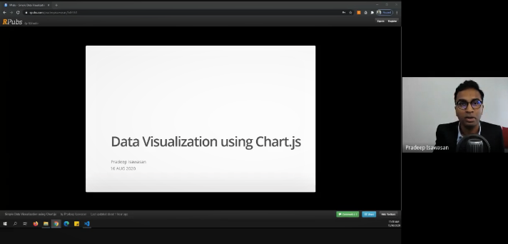
At the “Simple Data Visualisation using Chart.js” session, he firstly explained, “If your website or application is data-intensive, or you are planning to build a dashboard, then you will need to find a tool that will ease your visualisation. Using charts will make your website easier to understand and visually more appealing.”
“So in this case, using chart.js will enable you to learn quickly because it is simple and extremely customizable. It is also maintained by the open-source community. All you need is the basic knowledge of HTML, CSS and JavaScript, as well as text and source-code editors, such as Atom, or Visual Studio Code,” explained Dr Pradeep.
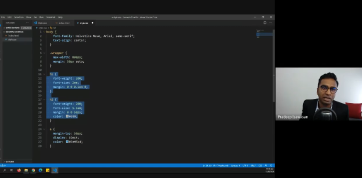
Dr Pradeep demonstrating the use of chart.js
“The first step is to create an empty .html file and .js file link in your .html page. You can add .css file if needed. Then link to chart.js CDN. The second step is to prepare a place in your HTML to render the chart. For chart.js, you do this by adding a canvas element and setting the width and height to define the proportions of your graph. In step three, you will prepare the data. The chart.js expects data to be passed in the form of a set of arrays. In step four, you will see that the types of chart available are line, bar, radar, pie, area, bubble and scatter,” said the speaker. To further elucidate the participants with demonstration, he used a simple line chart for Covid-19 cases in Malaysia to explain this point.
Both sessions later ended with interactive Q&A sessions.
© 2020 UNIVERSITI TUNKU ABDUL RAHMAN DU012(A).
Wholly owned by UTAR Education Foundation Co. No. 578227-M LEGAL STATEMENT TERM OF USAGE PRIVACY NOTICE