
Microsoft Publisher made creating brochure a possible
task for everyone. With the user-friendly functions, Microsoft Publisher
allows users to create brochures with professional look without the need to
acquire professional skills and knowledge. However, basic guides and methods
are ought to be learnt to ensure the capability of the software can be
optimised.
In conjunction with e-KLESF 2020, a workshop titled
“Creating Professional Brochures Using Microsoft Publisher in a Few Clicks”
was held to provide guide, tips and tricks in using Microsoft Publisher to
create brochures.
Speaker for the workshop was Faculty of Information
and Communication Technology lecturer Ts Soong Hoong Cheng. He said,
“Microsoft Publisher interface is very intuitive, thus does not need high
skills or knowledge of hidden function and techniques.”
Through the one-hour workshop, Ts Soong introduced
types of brochures, properties of a brochure, tips and many more. To ensure
better understanding, a practical demonstration for audiences was also held
afterwards. The audiences were also given a link to downloadable hands-on
practice for them to try on their own.
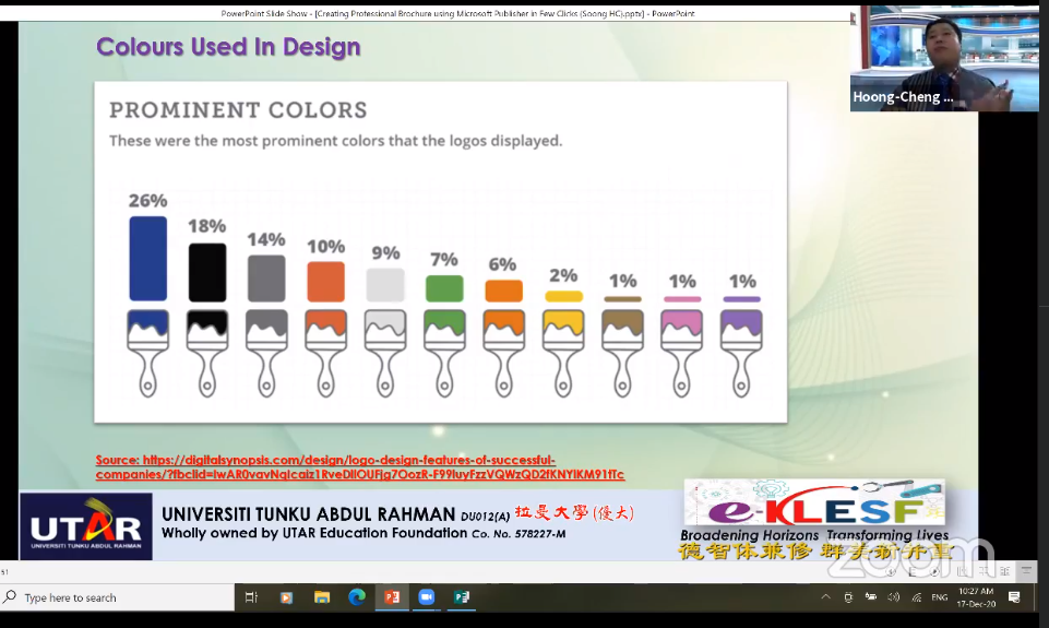
According to Ts Soong, blue symbolises
honesty thus used the most in design, followed by black representing class
and curiosity and red symbolising passion
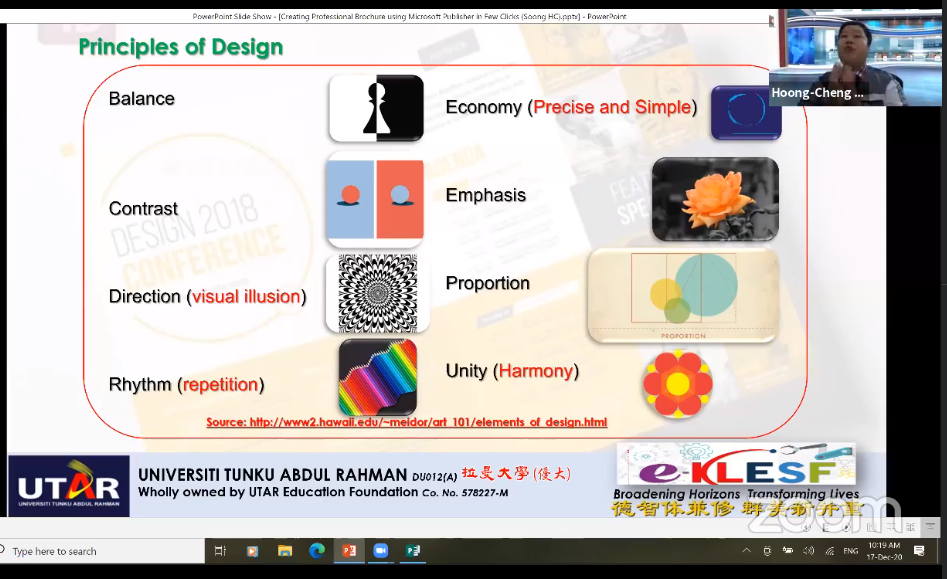
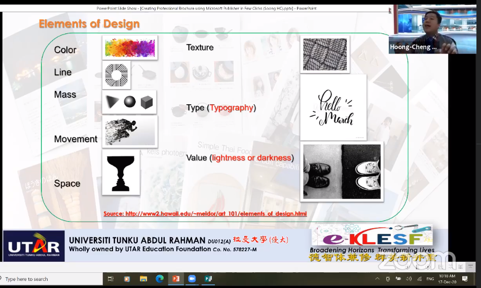
Ts Soong explaining principles and elements of design
that need to be considered in designing brochure
“For small-sized wordings, I highly recommend san
serif while for long-reading purpose I would recommend serif fonts. Anyhow,
you can use any based on your design and suitability,” Ts Soong said,
highlighting that there is no rule of thumb on which font to use. He also
reminded the audiences to use images with the size of at least 800 pixels x
600 pixels to avoid jagged lines or blurred image due to low resolution.
“Empty spaces sometimes can be relevant in a design.
If there are too many objects in an area of design, it gives a sense of
panic and anxiety. Contradict with that, leaving some space may give a sense
of calmness and elegance,” Ts Soong suggested.
For those who are interested to know more, you may
watch the full workshop
here.
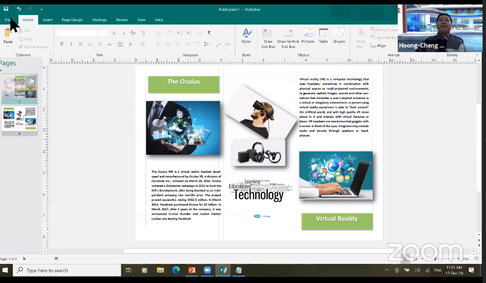
Ts Soong demonstrating the method of
creating a brochure from scratch
Wholly owned by UTAR Education Foundation Co. No. 578227-M LEGAL STATEMENT TERM OF USAGE PRIVACY NOTICE